
Color photography, learn how to control them!!
Colors in photography is one of the most powerful tools available to every photographer. But at the same time, it is not being properly exploited.
When we start taking our first steps in the world of digital photography. It is very easy to lose sight of the color in our photographs and not pay enough attention to them.
The thing that sometimes causes us to get very overly saturated pictures.
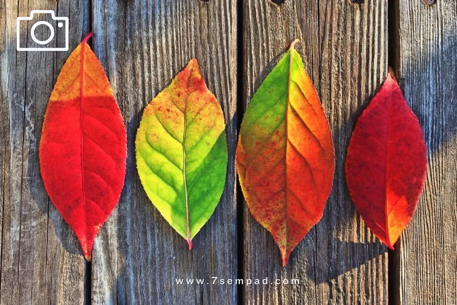
Source: Pexels.com / Pixabay.com / pxhere.com
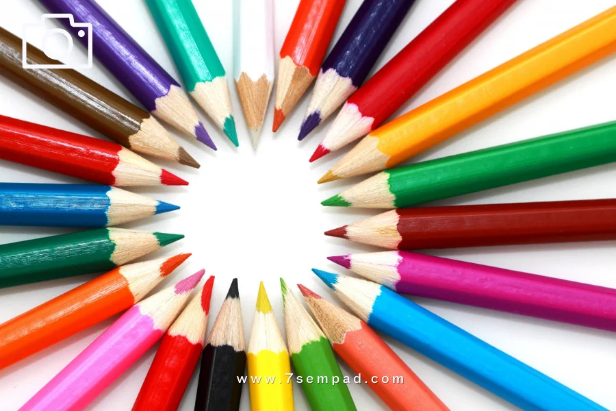
Circle color definition:
Source: Pexels.com / Pixabay.com / pxhere.com
- Orange: resulting from mixing the red and yellow colors in an equal quantity.
- Violet: is the result of mixing red and blue in equal quantities.
- Green: is the result of mixing the two colors blue and yellow in equal quantity.
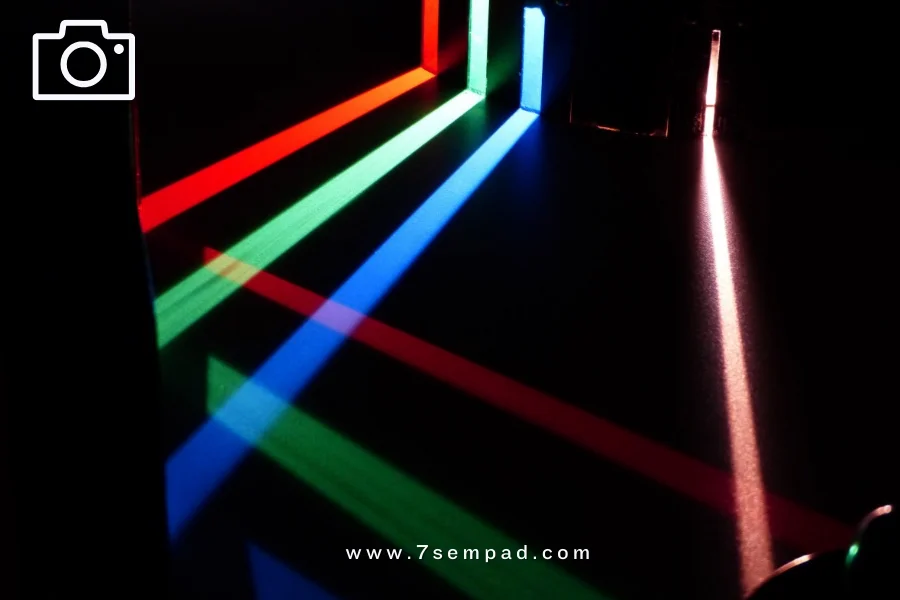
Color supplement:
Source: Pexels.com / Pixabay.com / pxhere.com
Colors in photography, neutrals:
The neutral colors are black and white. Not indicated, as it is not available in the color circle. It does not belong to any of the previous color groups. Neither the core nor the resulting subfolders.
Gray is the product of blending white with black in varying degrees.
So we get dark gray when black dominates, or open gray is caused by white dominating black.
The neutral colors were called this name, because they come closer to the color in which the quantity is greater than the other color when mixing between them.
This makes them impure or pure colors. It is said that the color black is nil in proportion to the blackened outer space, while the white color is caused by mixing all colors in equal quantities. That is, it is a reflection of all colors.
Source: Pexels.com / Pixabay.com / pxhere.com
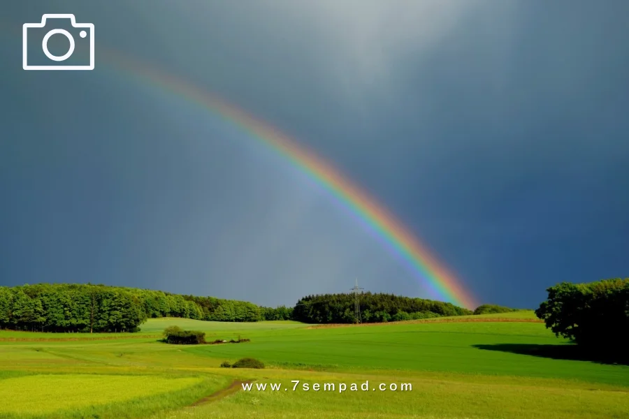
Cold and warm colors:
Colors in photography are also divided into two other parts:
Cold colors: blue, purple, and green. That tends to darken. The colors are more prevalent in the surrounding nature, such as the seas, rivers, and forests…
Use it to express calm and relaxation.
Warm colors: red, orange, and yellow. That tends to light and everything that symbolizes the source of heat.
Its use expresses joy, and it can also express anger … its beauty appears at sunrise and sunset.
Psychology of colors:
It is intended to affect the human personality and the feelings that convey it to the viewer. Below we show you some:
- Green: nature, harmony, sweetness, stillness, morals, and growth.
- Blue: sky, sea, confidence, seriousness, calm, and honesty.
- Yellow: warmth, kindness, positivity, brightness, and brightness.
- Orange: Innovation, Modernity, Youthfulness, and Vitality.
- Red: activity, heat, passion, aggressiveness, energy, and danger.
- Pink: diversity, innocence, femininity, tenderness, and romance.
- Brown: masculinity, earth, originality, and roughness.
These are the most important keys that you as a photographer must know about colors to deal with them wisely.
When you want to express a particular object and want the viewer to be attracted to it, use the color that suits it. Be careful to balance in shades to get a more accurate effect.

Leave A Comment